
Feel Instant Joy by Simply Applying Color Therapy in Your Everyday Life!
Have you ever heard of color therapy?
If you haven’t, then you’re in luck! As I am going to explain to you the entire science behind color therapy.
Chromotherapy or Color Therapy is a type of holistic healing that uses the visible spectrum of light and colors to alter a person’s mood and physical and mental state.
Hundreds of studies published in scientific journals have established the benefits of color therapy. However, the latest science suggests that the ability of color to impact emotional and physical well-being is far more potent than previously believed.
Today, I will share with you yet another surprising discovery in color science.
Let me introduce you to “Combined Color Therapy.”
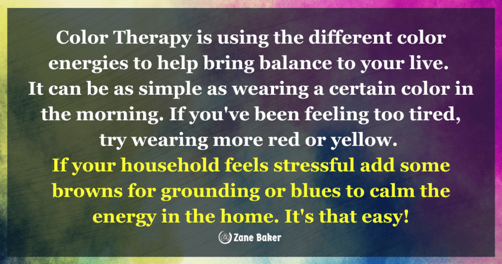
Combining colors in a specific way will trigger the brain to react positively or negatively.
The reason for that is each color in this color therapy combination has an energetic vibration signature, and when your brain looks at colors arranged in a specific way, then the brain reacts.
My goal here is to help your brain react positively and to feel a sense of pure joy in seconds.
Start by Pairing Two Colors as Described Below, to Get an Instant Positive Color Therapy Effect!
Each color combination is crafted to soothe your stress, improve your wellness state, and boost your mood.
1. Pink + Green = Eliminate Anxiety
The color pink is very soothing; that’s why lots of nurses wear some shade of pink scrubs at hospitals.
In a recent study conducted at The American Institute for Biosocial Research in Tacoma, researchers found 99% of participants experienced a greater feeling of calmness within 2.7 seconds of looking at different shades of Pink.
To boost the soothing effect of Pink, experts suggest pairing it with the color green.
Another study at the University of Georgia found that after looking at earthy colors for 30 seconds, 95% of participants felt more positive and at peace.
2. Yellow + Blue = Lift Your Spirit
Whenever you’re feeling kinda blue, just gaze at this contrasting color combo to boost your mood.
Yellow triggers the brain to produce the feel-good-hormone serotonin.
This, in return, will stimulate you and make you feel more awake and with a positive outlook.
Combine the yellow effect by adding the color blue; this can keep your brain from shifting back to that state of sadness because of blue trigger the brain to release the soothing chemical melatonin.
So feel sunny and serene in less than 10 seconds by gazing at the two hues.
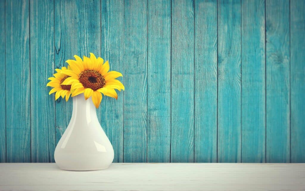
Here is this sunflower to get you started:

3. Green + Gold = Revitalize Your Mind
Whenever you have a hectic day, stop and take a walk in a sunny park!
Why?
Gazing at the trees “Colored Green” switches the brain from stressed beta waves to serene alpha waves, according to Leatrice Eiseman, author of “Colors For Your Every Mood.”
Combine that with the brain-boosting golden color of the sun, and you have quite a revitalizing recipe!
4. White + Blue = Say Goodbye to Cravings
If you eat to manage stress, you are not alone. The APS “American Psychological Association” reported that 27% of adults eat to manage stress.
See warm colors like red and orange promote hunger; that’s why fast-food restaurants use a combo of the two in their banners and ads.
On the contrary, white is a color that promotes tranquility. In a recent study, researchers found that staring at the color white for 30 seconds leads to a greater sense of tranquility, which is the opposite of stress.
Now adding a little soothing blue to your dining arrangement, and now you have a powerful combo that’ll have you well on your way to say goodbye to cravings.
In Essence, Colors Can Help You Control Your State of Mind
I personally am a big fan of having my workspace and sleep space color coordinated to ensure maximum productivity at my workplace and tranquility at my resting place.
So give any of these four combos a try and report back to me your findings!
Please let me know in the comment section below what you think about these color combos.
Do you have a specific one that you feel the most attracted too? If some, let me know in the comments!
Wishing you a COLORFUL day!
With love, light, and gratitude,
Zane


Facebook Comments